obsidian says this takes 13 minutes to read.
look at the page updates here.
One of my favorite things to do on Linux is to customize and generally tweak anything and everything on the operating system. It’s like a thing I do to try to relive the “good old days” where theming was a thing that was available pretty much everywhere. I think the thing I miss the most on computers was the theme-ability of generally everything. I miss being able to select the classic theme on Windows XP or 7 and go to town with theming a bunch of shit in the way I wanted to, it is my god given right to make Comic Sans the system font and no one will stop me.
However, as time went on, themes started to go away. The tasteful Windows Aero theme went away and gave way to more awful-er things, like Metro UI and its successor, Fluent. These design languages give this sorta flatness to everything, generally look boring as fuck, and severely limits on what you can theme on the OS. And then Windows 11 came with the hammer and was like “fuck you” and proceeded to rip out what was left of Windows customization, so now we end up with computers and installs of Windows just looking so sad and miserable because there isn’t much to customize anymore. Sure, you could change the wallpaper, maybe the accent color, but nothing else. The OS is as static as it will ever be, and it will only change only if Microsoft wants it to. You cannot change icons, cannot change how the OS generally looks and feels, nothing. And sure, you could install some mods and other stuff to change how the OS looks like, but these often are more like hacks, never really intended to be used full time. Using these mods were a great way to break your OS, and leave it in a strange state.
I should say there are great programs that do the lord’s work into making Windows 11 into less of a drab experience. There is OpenShell, and Wallpaper Engine, Rainmeter, Explorer Patcher, and there are paid tools from StarDock (however they’re fucking assholes1 so maybe reconsider) that allow you to change how stuff looks. But the issue with these programs is that they are not stable at all, and I feel like I am making my Windows install more unstable by installing this into my PC. And the fact I need to modify DLL files for certain mods kinda makes me not want to deal with it at all. Even with “simple” tools like Start11, I feel that the program becomes more and more unstable the more Windows gets updates. And of course Microsoft would never offer support for Windows mods, so there is that.
Anyways, with the worse-ing of Windows2, I’ve been considering a future away from Windows and Mierosoft, and that means that I have been using Linux quite a lot recently. I’ve honestly been quite happy with the experience, even when it does have some occasional pitfalls (looking at you NVIDIA graphics drivers and Pipewire). Another cool thing about using Linux is the ability to customize literally anything in the OS. This post is basically looking at the customization that I have done so far.
the theme
A thing that kinda irks me when people do their own customization is that they try so hard to replicate an existing OS. Like, go to r/unixporn and take a shot every time you see someone trying to make their KDE Plasma system into macOS and you would most likely die of alcohol poisoning. Like, I prefer themes to look more unique, like they belong on the Linux platform, instead of the equivalent of someone’s face grafted onto someone else. Another thing I kinda don’t like is how the Linux customization community make their own OSes into this mess of background blur, tiling window nonsense, un-intuitive design, a shitload of wasted space, and other things that I don’t really get. Also if you’ve been on that subreddit before, the next time you browse there, look closer at what programs they have open. Most likely it is a very curated list, because the moment they open stuff like Firefox or whatever program they need to actually do their work, the perfectly curated look and feel of what they have is instantly shattered.
I also am not a fan of the flat and rounded UI design a lot of these themes have, like sure these look nice, but honestly? They feel soulless, like a design that you’ve seen around in phones and computers for nearly 10 years now. I wanted something more unique, something that people could point out and be like “hey what the hell is going on with your computer?”. It is for this and other reasons why I like more retro looking themes. Stuff like Reactionary or the Commonality (specifically, Commonality Gris) themes on KDE Plasma. For some reason, I like how CDE looks, or more like, how it makes me feel while using it. I can cosplay as a late 90s engineer working on some very expensive UNIX workstation, aka a guy who has his shit together i suppose, lmao. It also has some design elements that I really do like, like chiseled elements for the scroll bar, and the minimize/maximize/close buttons. It is like a middle finger to that flat UI design that seems to be everywhere.
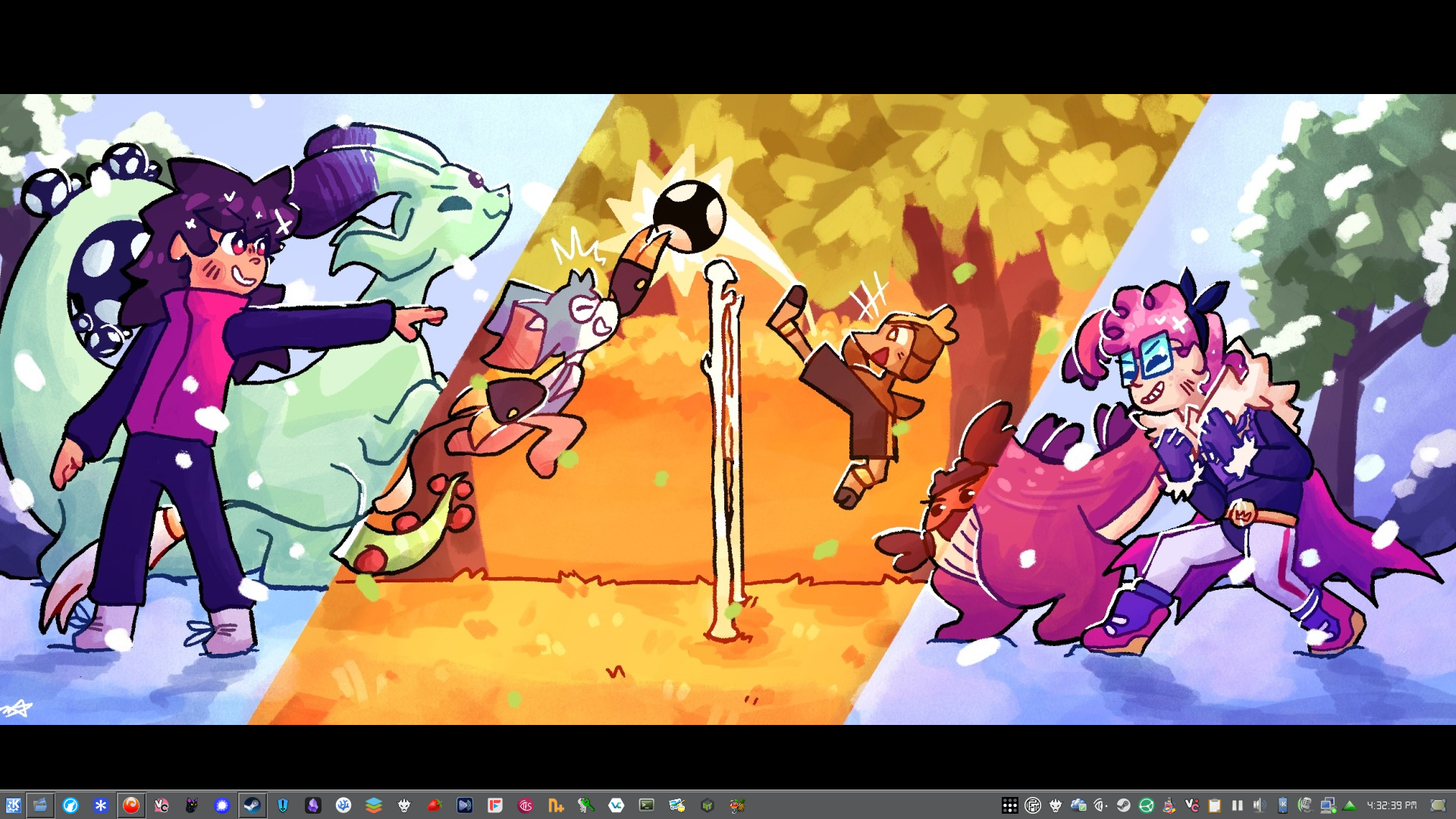
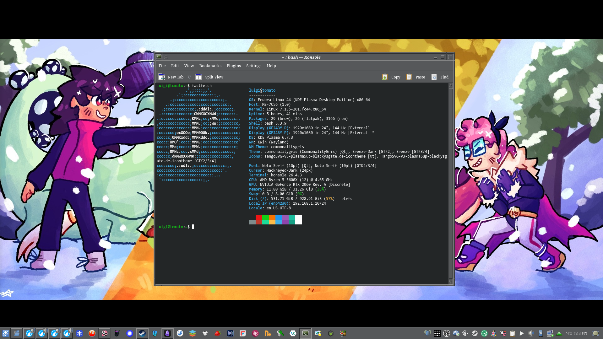
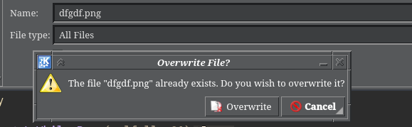
Anyways, the theme I am currently using is one called Commonality Gris. It is a semi-dark mode theme based off CDE, with all that chiseled UI that CDE has. In order to make it more consistent, I also installed a tool called Kvantum, which imports application styles into Plasma (and the theme also has its own Kvantum theme that requires to be installed), and which kinda completes the look of the OS, adding that chiseled look into more places like the scrollbar, buttons, tabs, and other places.
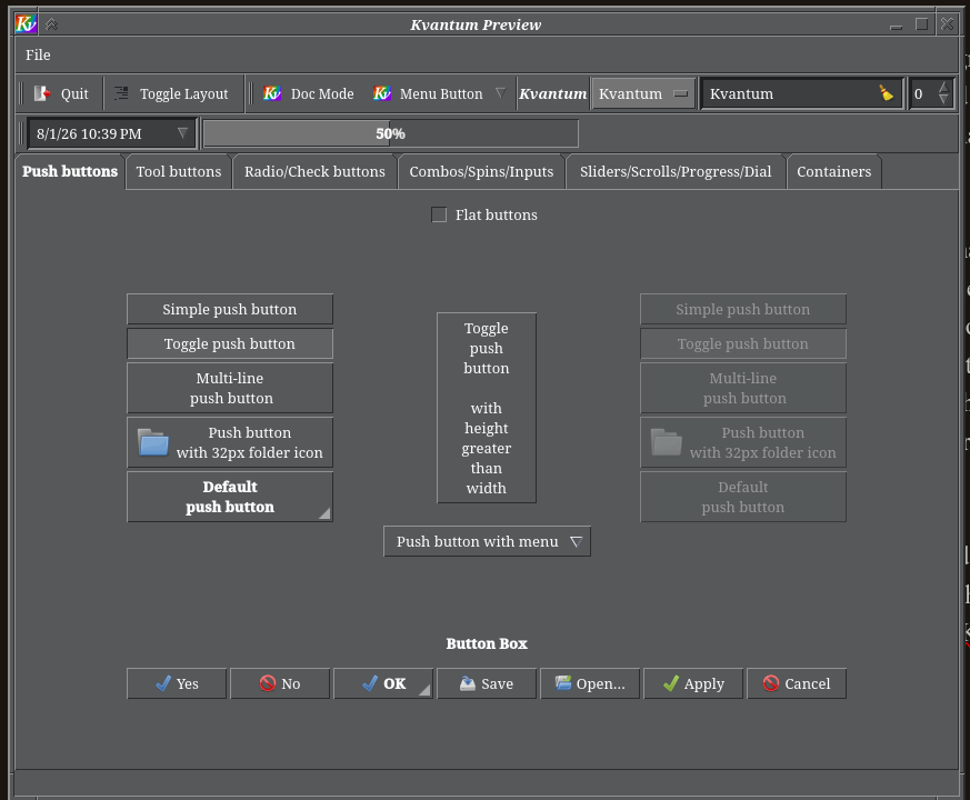
As per usual, theming Linux is never perfect. While most apps do respect your theme, there are some outliers that will never follow your theme, no matter how much you tell them to. These apps often use the GTK framework, and don’t look kindly to modding them at all. On my system, after I was finished adding the theme, a lot of these GTK apps were missing icons, which was indeed an issue and I have yet to figure a solution to this. Maybe someday.

panel configuration
Panels are kinda the taskbars of the KDE Plasma world. These are the main ways of customizing shit, and these are very customizable. In theory, you can make KDE Plasma look like any OS you like, from MacOS or Windows, and everything in between. However, by default, KDE has a very Windows style taskbar setup, which should feel right at home for those who come from Windows (like me). You’ll see later that even after customizing a lot, I still have a very Windows layout, with some customizations to make it look better/be more useful.
So the way I have my panels set up, there is one for every monitor I have. The left monitor has a panel with a button for the application menu, alongside other things like the task manager (which shows icons only). There is nothing pinned on this panel, instead, I configured it in a way that it only shows active programs on the monitor itself. I also made it so the task manager would never group windows by program, instead it will show every single open window as its own icon. I first saw this as an option for Start11, which I decided to copy here.

On the same panel, I also have a music player widget placed, and it shows whatever media that I may be playing at the time. It also works for music playing on your phone, which KDE Connect can pick up, and it will display it on the widget too. On the right of the music widget, there are some monitoring graphs for GPU temp, usage, and VRAM usage, alongside a memory usage graph, and a CPU usage graph as well. These are pretty neat, and serve as a quick reference to how my computer is doing. I chose graphs instead of a number because I thought it would look more interesting, and turns out, it does, so that is very nice. Finally, I have a clock widget displaying the time and date, the date is in ISO format (aka year-month-day), and the time itself is in 12 hour time, without seconds, because apparently the font doesn’t play well with the clock. The font itself is one called DS-DIGITAL which is sized 14pt, which I think looks very nice and it kinda gives me that classic KDE vibes. Finally, there is a desktop peak widget, which allows me to see how the desktop looks like.

Continuing on with the main monitor, there is a shortcut for the application menu, there is also a task manager too, and this is where all the pinned programs are. Similarly to the other panel, programs do not group, instead the windows are shown individually. This is also where the system tray is at, which shows all programs that are running in the background, and which I have only allowed the most important ones to show themselves. Finally, there is a clock (this time, showing only the time with seconds), and another desktop peak widget.


icon packs and cursors
Trying to find an icon pack that covers most of your apps on Android is easy, but on Linux? That is pretty hard. Most icon packs often don’t cover individual apps (sometimes, if you’re lucky, they’ll cover stuff like Krita and Kdenlive and other Linux native/popular apps), which is a thing that kinda sucks, but it is how things are now.
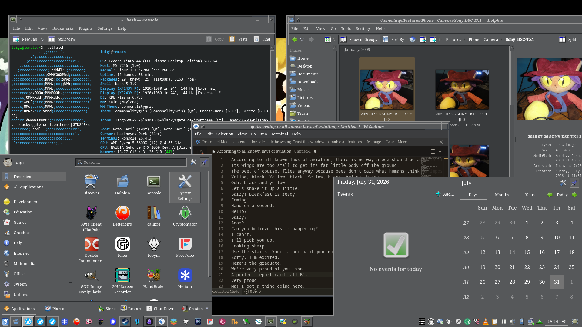
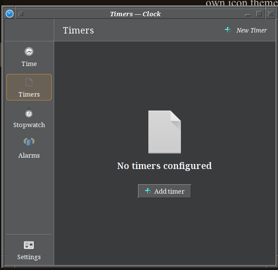
After some searching, I did end up finding icon packs that I particularly liked a lot. are TangoSVG V3 and KrystalSVG. The first one is an icon pack with an old GNOME-ish look that feels right from 2003, and KrystalSVG is (from what I can tell) a icon pack that is based off the kinda design that KDE had around 2007 or so. However I feel that I could do better, maybe find an icon pack that could do much better fitting in with the CDE/Win98 aesthetic that I’m trying to recreate. The issue is that oftentimes any icon pack that i find, misses a bunch of crucial icons that make the OS either uglier, or harder to use. For example, on certain themes, the connection manager icon is missing (aka the place where it tells you how your computer is connected to the network), or some apps are missing certain icons (for example, KDE’s Clock app), among other issues. I think the best solution at the end of the day for this would probably just be to build my own icon theme, mixing and matching icons until there are no missing icons left. Anyways, I ended up settling with the TangoSVG icon pack, because I feel it fits in better with the grey elements of the Commonality theme. If there is something I wish existed on KDE Plasma, it would be something like an exclusion list of what programs can use your icon theme, in this way, it kinda helps with avoiding situations where certain icons are missing.


Finally, there is the cursor. Generally I don’t really like changing the cursors because I think that the default KDE ones look nice enough. But I decided to find some sort of icon theme that would look nice with the Commonality theme installed, and the ones that I choose to use are these called Hackneyed, which are Windows 3.x inspired cursors that generally look pretty nice, and have some neat animations (like the hourglass turning). It all just comes together at the end, I think.
the font
When it comes to fonts, I decided to stick as close as how CDE did it. CDE uses a sorta serif font for a lot of the interface, and sometimes it uses another monospaced font in certain areas. It honestly is not consistent, and I think it varies depending on the distribution of UNIX you were using it on or whatever.

By Huihermit - Own work, LGPL, Link

By Huihermit - Own work, LGPL, Link
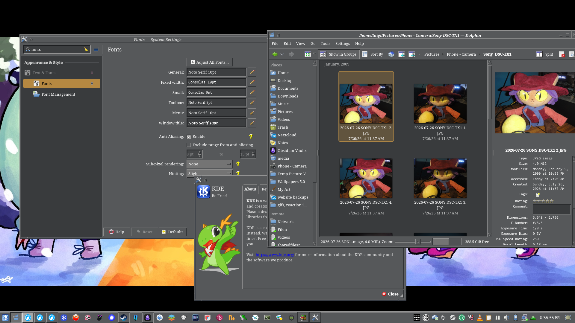
Anyways, I decided to try to replicate the look of the serif fonts, so that is what I did. I used Noto Serif on most parts of the OS, and using Consolas for other parts like for smaller fonts, and fixed width fonts. I think it looks pretty nice, and fits with the gray look of how the Commonality theme looks like.
other random things
-
i use only two kwin scripts: one that focuses any window that requires my attention (similar to how windows works), and another one that centers all new windows to the middle of the screen.
-
i added a small “keep on top of everything” button that helps in certain cases where i need a window to stay on top for something i am doing.
-
i really really really wanted to have a screensaver, but sadly there isn’t a way to do that on wayland, there is xscreensaver but that doesn’t work the way i want it to (aka a screensaver turning on after not using the computer for a while, and when i move the cursor, it would drop me into the lockscreen)
updates:
- 2026-08-05: page was created.
-
aka selling versions separately with no upgrade path. i purchased start11 with the fucking multidevice upgrade, and then I found out they released a new version that i could not upgrade to, without paying even more fucking money, they did not disclose this at all on the steam page, so those who purchased start11 are basically forced to pay for the next version of start11 v2 because fuck you i guess.↩︎
-
examples: ai bullshit forced into windows, the whole gdid tracker that got a hacker arrested, the file browser getting progressively worse for managing large amouints of files, the time I had an issue with a broken driver that kept giving me bsods constantly, among other issues.↩︎